There’s a whole world of hidden gems behind the brands we know & love, with those familiar logos hiding secrets most of us never notice. Some of these are clever design tricks, while others are top-secret recipes—either way, these companies have some surprising tales up their sleeves. Let’s look at thirteen secrets behind America’s favorite brands. Who knew that companies could be so mysterious?
Featured Image Credit: manupadilla /Depositphotos.com.
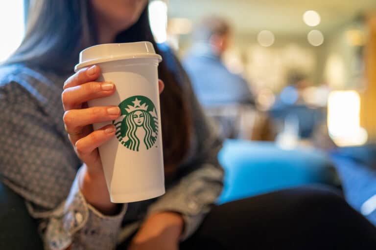
Starbucks’ Nautical Naming Roots

Starbucks almost went by a completely different name as the founders were considering “Cargo House” & “Pequod”—the whaling ship from Herman Melville’s novel *Moby-Dick*. In the end, they chose “Starbucks,” who was the first mate in the book. Their goal was to add a little nautical lore to your daily cup of coffee by tying the brand to the seafaring traditions of old coffee traders.
KFC’s Recipe Locked Away

KFC’s famous chicken gets its flavor from a secret blend of 11 herbs & spices, although the original handwritten recipe is tucked away safely in a high-security vault at their headquarters in Louisville, Kentucky. Only a few trusted employees know the full details and they’re sworn to secrecy to protect the fast-food joint’s secrets. These tight security measures keep that distinctive taste unique to KFC—but plenty of people have tried to recreate it.
The Real Colonel Sanders

Speaking of KFC, Colonel Sanders wasn’t just a character but rather a real person who started selling fried chicken during the Great Depression. He sold his food from a roadside spot in Kentucky, with his secret blend of herbs & spices eventually catching on. Before long, he began franchising his recipe and KFC was born—his face still represents the brand, even though many people think he was fictional.
The Bite in Apple’s Logo
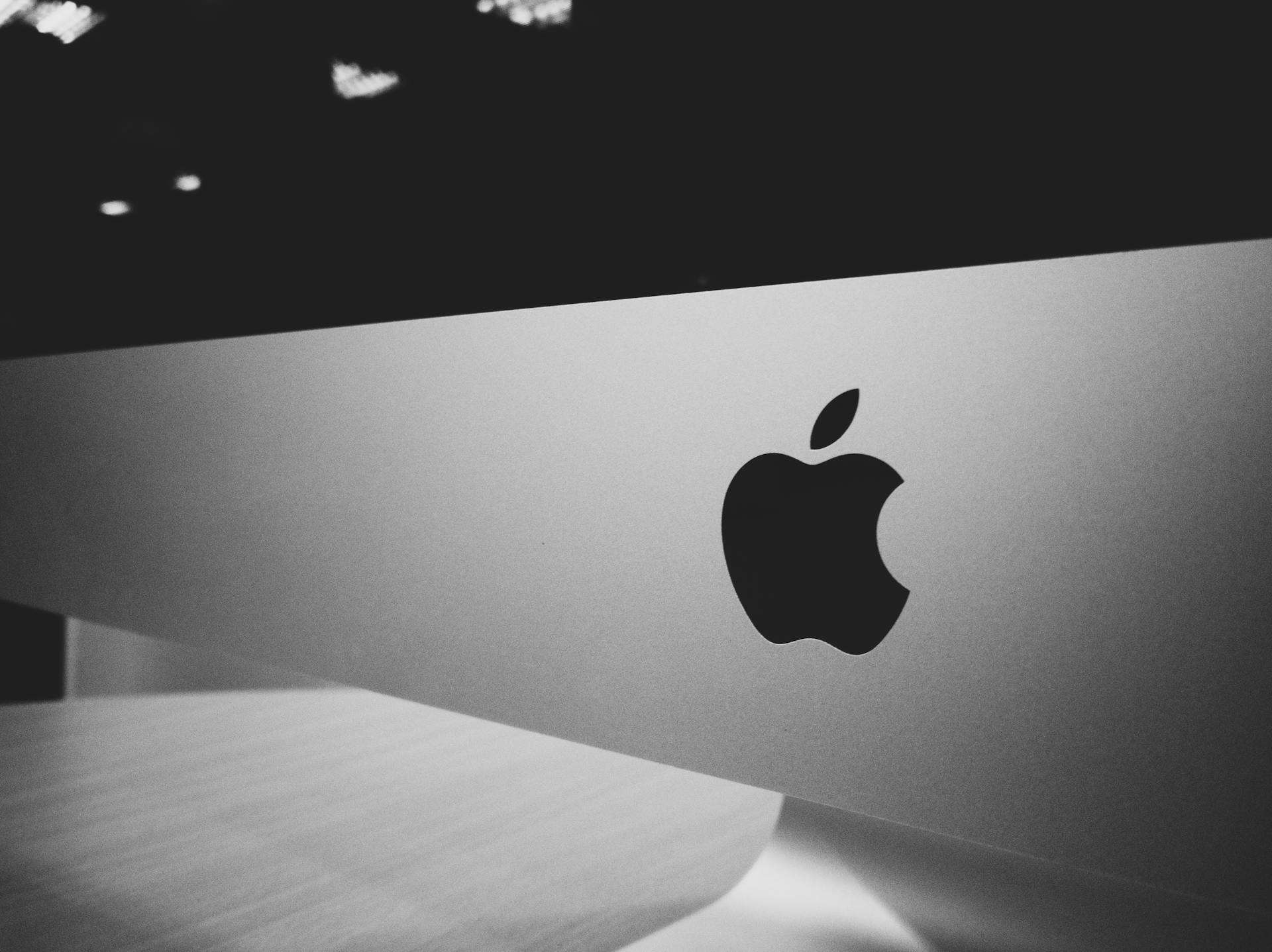
There’s more to Apple’s logo than just a piece of fruit, as the bite in the apple is a reference to the word “byte,” which is a computer term. It also makes sure you realize it’s an apple, like the company’s namesake, not some other round fruit like a cherry or tomato. Some people claim it’s also a reference to the Garden of Eden but there’s no proof of that.
Coca-Cola’s Wine Adventure

Believe it or not, Coca-Cola once tried to enter into the wine business and in the 1970s, they bought Taylor Wines, which was one of the biggest wineries in the U.S. However, this business venture didn’t last very long and they eventually sold the company off to return their focus to soft drinks. Who knows what kind of products Coca-Cola would sell today if it had been successful?
Amazon’s Smiling A to Z

Most people recognize that Amazon’s logo is a friendly smile but it’s also so much more than that, as the curved arrow goes from the “A” to the “Z.” It’s meant to suggest that they sell everything from, well, A to Z, making for a rather clever way to show off their huge range of products. Plus, the smile makes the company seem more welcoming, which is rather fitting for a brand that supposedly focuses on customer satisfaction.
Nike’s $35 Swoosh

Everyone has seen the iconic Nike swoosh but most people don’t know the story behind it, as it was designed back in 1971 by Carolyn Davidson, a graphic design student. She was paid just $35 for it, even though the brand is estimated to be worth around $85 billion today. As Nike soared to global fame, they showed their appreciation by giving her a diamond ring and some Nike stock—not a bad deal for a logo that’s now worldwide.
The Mystery of Dr Pepper’s 23 Flavors
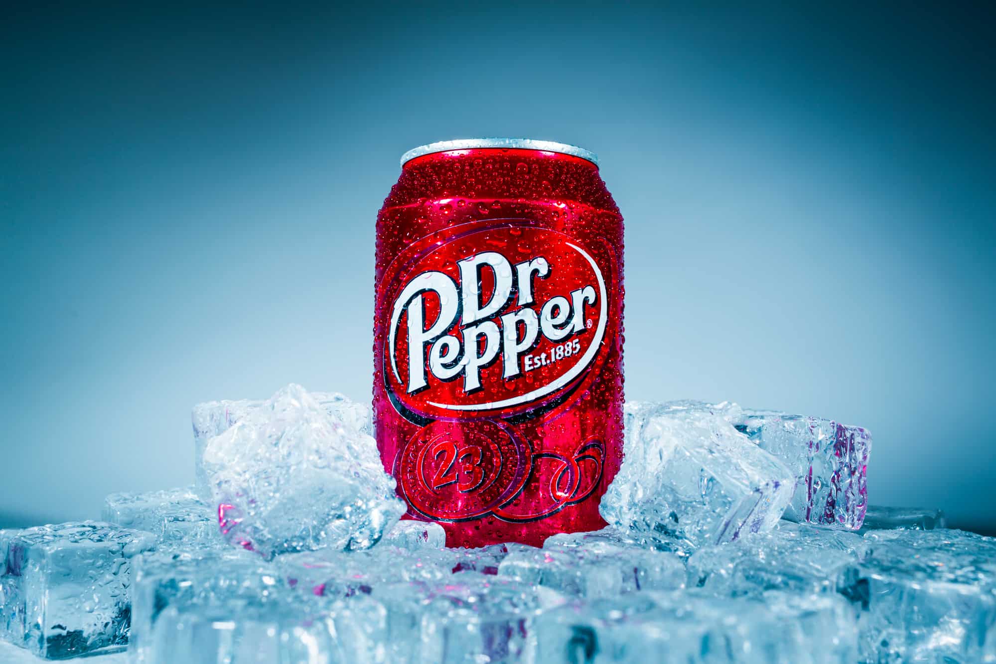
Dr Pepper claims to have a blend of 23 flavors, yet we have no idea what they are, although fans have tried to crack the code for years. They’ve guessed all kinds of flavors, such as cherry, caramel—even prune juice. However, the company hasn’t revealed anything and the secret recipe stays under wraps, keeping everyone curious about just what it is that makes that unique taste.
Disney’s Secret Club 33

Tucked away in Disneyland’s New Orleans Square is Club 33, a super exclusive members-only spot that’s the only place in the park where you may get an alcoholic drink. Joining isn’t easy since you’ll need to be rather rich and have plenty of patience to get through the waiting list. Celebrities and VIPs often visit Club 33, making it a hidden place that most visitors never even know exists.
Subway’s Logo Arrows

You should look at the Subway logo next time you’re grabbing a sub because the arrows on the “S” and “Y” represent the entrances & exits of a subway station. It connects the brand to its namesake and references how they have quick meals for people on the go. The design is also meant to represent convenience & speed, just like hopping on and off a subway train.
Google’s Playful Name

Google’s name isn’t just a made-up word but rather a twist on “googol,” which is a 1 followed by 100 zeros—the founders picked it to show how much information they aimed to share. The misspelling was accidental but ended up sticking and, now, “Google” has become a household name. Something tells us the name probably wouldn’t be so well-remembered if it were spelled correctly.
Jeep’s Seven-Slot Grille

Jeep’s seven-slot grille actually has meaning to it because the seven slots represent the seven continents, which is meant to reference the brand’s global reach. Jeep likes to point out that their vehicles have traveled all over the world—so every time you see that grille, you’re seeing a symbol of their international adventures. The design dates back to World War II.
Tostitos’ Hidden Snackers

Take a closer look at the Tostitos logo to see another secret—the two lowercase “t’s” in the middle look like people sharing a chip, with the dot over the “i” being a bowl of salsa. This design is meant to create a sense of togetherness & enjoyment for the customers. And honestly, it’s quite accurate since we love celebrating good times and good company with some Tostitos.
Disclaimer: This list is solely the author’s opinion based on research and publicly available information.
Like our content? Be sure to follow us on MSN.
Read More: