We’ve all had those days when we go to the store for milk & bread—but end up with a cart full of goodies. It’s because stores have clever tricks to make us buy more and they arrange things in ways that catch our eye & appeal to our senses, all to encourage extra purchases. Here are ten sneaky layout strategies that grocery stores use to get us loading up our carts. From the moment you step inside the store, everything is set up to tempt you!
Featured Image Credit: kalinovsky /Depositphotos.com.
Essentials Placed at the Back
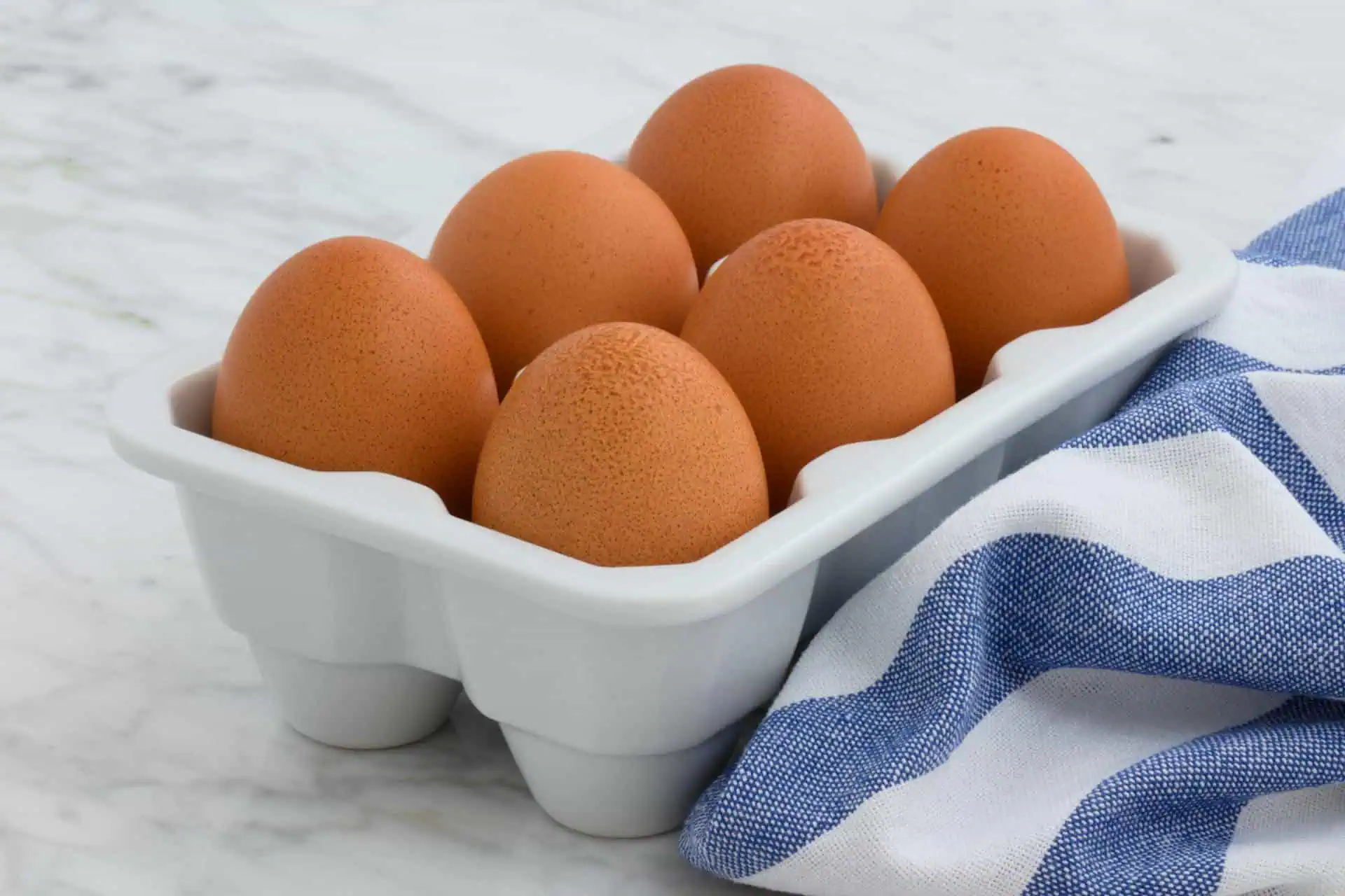
You might’ve noticed how basics like milk, eggs & bread are all the way at the back—that’s no accident because placing everyday items far from the entrance means you have to walk through aisles filled with other products first. As you pass shelves of snacks & drinks, it’s easy to pick up a few extras you weren’t planning on buying. Your basket becomes fuller than expected because it’s so hard to resist temptations!
Fresh Produce Greets You

The first thing you see when you walk into a store is a rainbow of fresh fruits and veggies, which gives you a good feeling right away. This pleasant start puts you in a buying mood & makes you more likely to keep browsing the rest of the store—it also makes you feel better about putting some treats into your cart later on. Everything in the store is specifically designed to make you spend more!
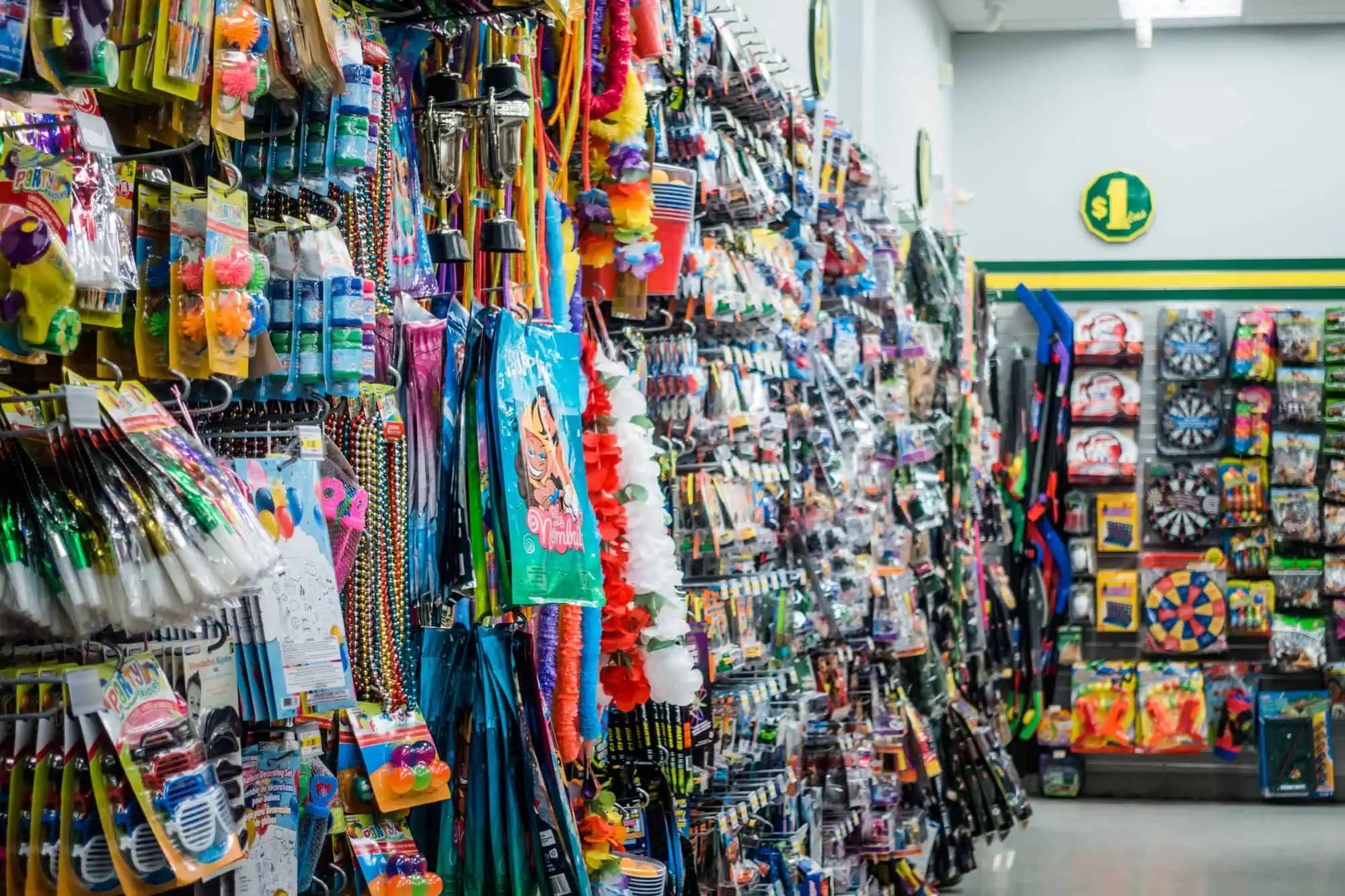
Long, Winding Aisles

Most stores have aisles that seem to stretch on & twist without any shortcuts and this is so that you’ll walk down the full length of the aisle to find what you need. You pass by many other products and you’re more likely to spot items you hadn’t planned on buying. As such, this setup increases the chances that you’ll add extra things to your cart.
The Right Turn Trick

Some grocery stores in the U.S. design their pathways so shoppers naturally head to the right as they enter because Americans drive on the right side of the road & walk on the right side of hallways. In England, stores sometimes do the opposite to match left-side traffic flow and this layout encourages people to pass certain displays or promotions first. The more products you pass, the more likely you are to buy them.
The Perimeter Path

Many stores have a “racetrack” design along the outer edges and this setup places fresh departments like meat, dairy & produce in a loop around the store’s boundaries. The goal is to encourage you to wander through key sections without missing anything as you go through multiple entrance points of the aisles. You might dip in and browse for items you didn’t plan to get because you’ve covered a lot more ground.
Hidden Clocks

Some grocery stores leave out clocks or place them where you won’t easily see them—they might also limit windows so you can’t gauge the time of day. Without these clues, you spend extra minutes roaming each aisle, and that raises the odds that you’ll add a few unplanned items to your cart. It may not be as noticeable as a big display or flashy sign but it has a real impact on how long you stick around.
Seasonal Power Aisles
Stores change certain aisles or sections throughout the year to promote items tied to upcoming events–think sporting season gear in late summer or holiday baking supplies in the winter. These displays usually sit in prime real estate like the middle of main walkways so you can’t avoid seeing them. In doing so, you’ll feel curious to see what’s down the aisle and might inspire you to do some impulse shopping.
Limited Seating

Not every store has a place to sit and that encourages you to keep walking—some places only have a small bench or a narrow dining area near the deli! With fewer spots to take a break, you end up covering more ground in search of what you need and that means you’re more likely to spot items that catch your eye. This design maintains steady foot traffic and leads you past more merchandise which is exactly what the stores want.
Angled Aisles

Some stores angle certain aisles or tilt them slightly off-center because this makes it harder to see all the way through—so you’re more likely to go down the aisle to see what’s there. Angled aisles also create mini-nooks where certain items feel more exclusive or interesting. It’s a subtle layout choice that keeps you exploring.
Zigzagging Checkout Lines

Stores use zigzagging checkout lines to maximize space and show off smaller items while you wait. Instead of a straight path, the line might curve or snake around, making you walk past racks of candy, magazines & gadgets so you’re browsing right up until you pay. By the time you reach the register, you might’ve added an extra pack of gum or a random item to your haul!
Disclaimer: This list is solely the author’s opinion based on research and publicly available information.
Like our content? Be sure to follow us on MSN.

