
Sometimes, a rebrand is a good idea and gives brands a fresh new look or a snappy new name. But sometimes, a logo update or renaming can get companies in trouble. It might look great on a PowerPoint in a boardroom, but it can cause confusion, frustration, and even anger in the real world. So we did some research on U.S. companies that learned that lesson the hard way. Here are 9 rebranding mistakes by major U.S. companies that blew up in the most unexpected ways.
Featured Image Credit: Shutterstock.
Cracker Barrel’s logo change

In 2025, Cracker Barrel decided that its mascot “Uncle Herschel” was holding the brand back. By getting rid of the man in overalls, the logo redesign aimed to give Cracker Barrel a more modern look. Diners were furious, saying the nostalgia was what made the restaurant special. Within days, Cracker Barrel had taken down the new logo and restored the old one.
Gap’s one-week disaster

In 2010, Gap rolled out a new logo with a plain font and a small blue box. Customers immediately reacted and claimed it was generic, too small, and a “cheap imitation” of the original Gap. Just seven days later, Gap ditched the change and returned to the old design.
Tropicana’s packaging overhaul

Tropicana redesigned its juice cartons, replacing an orange-with-a-straw icon with a plain glass of juice. Consumers had no idea what the bottles were when browsing stores, and sales plummeted 20% within two months. Tropicana quickly reversed the change and restored the original design.
RadioShack becomes “The Shack”

RadioShack shortened its name to “The Shack” to try to sound edgier and trendier. However, instead of attracting customers, the name came off as strange and desperate. The rebranding didn’t save the company from decline, with most stores gone by 2017.
New Coke

Coca‑Cola reformulated its flagship drink in 1985 and unveiled “New Coke” to compete with Pepsi. Fans were furious, seeing it as an attack on a cultural icon, and sales plummeted. Just 79 days later, Coca‑Cola reintroduced the original recipe as “Coca‑Cola Classic” to regain customer trust and loyalty.
Mastercard’s “Three-Circle” logo

In 2006, Mastercard spent nearly $10 million on a logo redesign. The logo was supposed to visually communicate the company’s business model. But many people thought it looked cluttered and off-balance. The logo ended up being used mostly for corporate purposes, while customer products stuck with the old one.
Uber’s abstract Logo

Uber replaced its name-based logo with an abstract symbol called the “bit.” Riders and drivers alike found it confusing, and the brand lost instant recognition. After two years of complaints, Uber went back to its wordmark in 2018.
Twitter becomes “X”

When Elon Musk rebranded Twitter to “X” in 2023, the reaction was swift and mixed. Many users felt the platform lost its identity by dropping the familiar blue bird and even the word “tweet.” Critics say the rebrand destroyed years of brand recognition.
Pepsi’s globe redesign
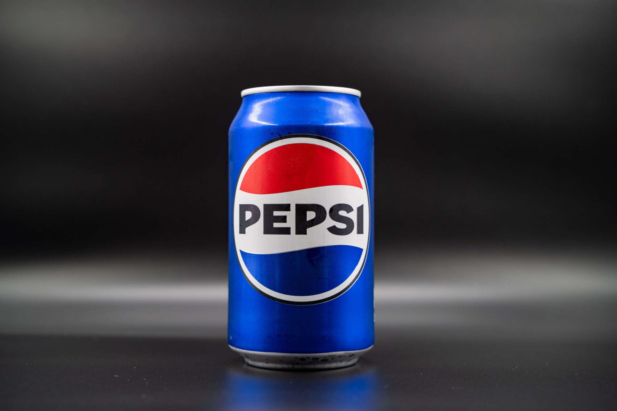
Pepsi frequently modifies its globe logo, but its 2014 update was met with confusion. Consumers felt the shapes were lopsided and varied too much in color, drifting too far from their familiar Pepsi. The new logo left people puzzled rather than intrigued.
Like our content? Be sure to follow us.

